B2B
STURTUP
#personal project
Case Study: A Failed Legal Platform
It was conceived as a digital platform for organizing and searching business documents.
07.2024 — 11.2024 / 5 months
ROLE: Product Designer
//CASE STUDY
A UX Case Study of a Failed Project
Overview
The original request: a 3-page micro-site (Catalog, Registration, Payment).
The reality: The concept quickly expanded into a complex SaaS MVP with subscription, document editing, admin tools, and secure payments.
Goal
To build a database of legal documents, constantly updated in accordance with changing legislation, that enable businesses to handle legal needs independently online.
Stakeholders
Executive team:
Product designer
Front-end developer
Back-end developer
Project manager
Legal team:
Lawyers
Business owner
Project Challenges
01
Making the platform intuitive for non-expert users is crucial.
02
Ensuring robust security for sensitive legal data.
03
Balancing simplicity with user confidence and retention.
04
To break down the desired end product into phases and define the minimal set of features for the MVP that would still deliver real value to users, while postponing non-essential elements for later stages.
//METHODS AND TOOLS
- Competitive Analysis
- Personas (role-based structuring)
- User Journey Mapping
- Wireframing
- Prototyping
- Information Architecture
- Usability Testing
//My design deliveries
- Branding
- Mind maps
- User flows
- Wireframes
- Interactive Prototypes
- UI Components Library
//MY PROCESS: STRUCTURE
//PROCESS
RESEARCH
01
Gathering Insights from Lawyers and the executive team
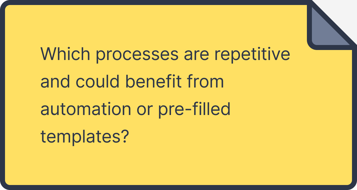
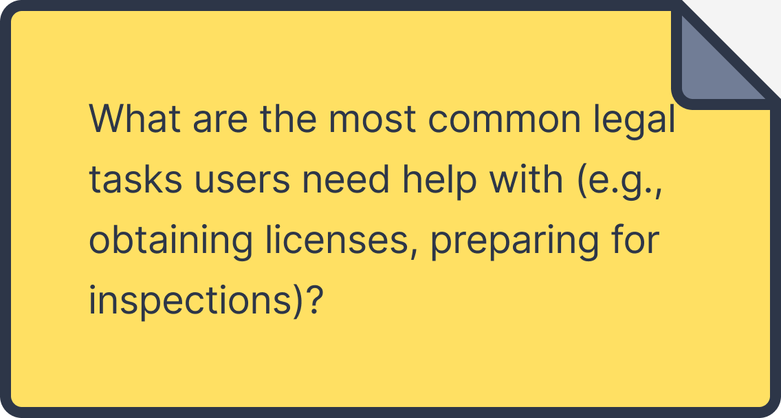
I conducted structured interviews with the law firm’s partners and in-house lawyers to understand the most common client needs, pain points, and legal processes that could be digitized.
Competitor Analysis:
Analyzed similar platforms in the market to learn best practices for presenting legal content.
Did you know?
Many small businesses spend up to 20% of their budget on legal services, often because they lack access to simplified resources tailored to their needs.
//Questions I asked the team
//Questions I asked lawyers
//PROCESS
DEFINE
02
Findings
- The law firm receives many clients who want to start a business and need the same documents repeatedly, so Lawyers identified they could automate the document provision process
- Many business owners lacked knowledge of which documents they needed and how to prepare them.
- Users struggle to find documents that are updated according to changing legislation, they need assurance that documents comply with current legal requirements
- Users valued personal reassurance from a lawyer, not just automated tools.
- This particular niche appeared to be free/unoccupied
Scope Evolution
The project’s initial scope was limited to a simple catalog offering document templates for download.
However, as requirements evolved, the scope expanded to include an email confirmation system, secure data protection measures for payment information, user personal accounts, an admin panel for lawyers, functionality for updating documents, a tag and categorization system, document verification by lawyers, and the ability to provide custom document recommendations based on the user’s business type.
03
Solutions
- Main advantage should be constantly updated documents
- Proposed subscription-based pricing to provide ongoing access to updated
- Design a progressive scope plan: release only high-impact features first, then iterate based on feedback documents
- To use Vue.js and their standart component library to speed up work and save time for MVP
//PROCESS
DEVELOP
STAGE 1.0: MPV
04
1st iteration
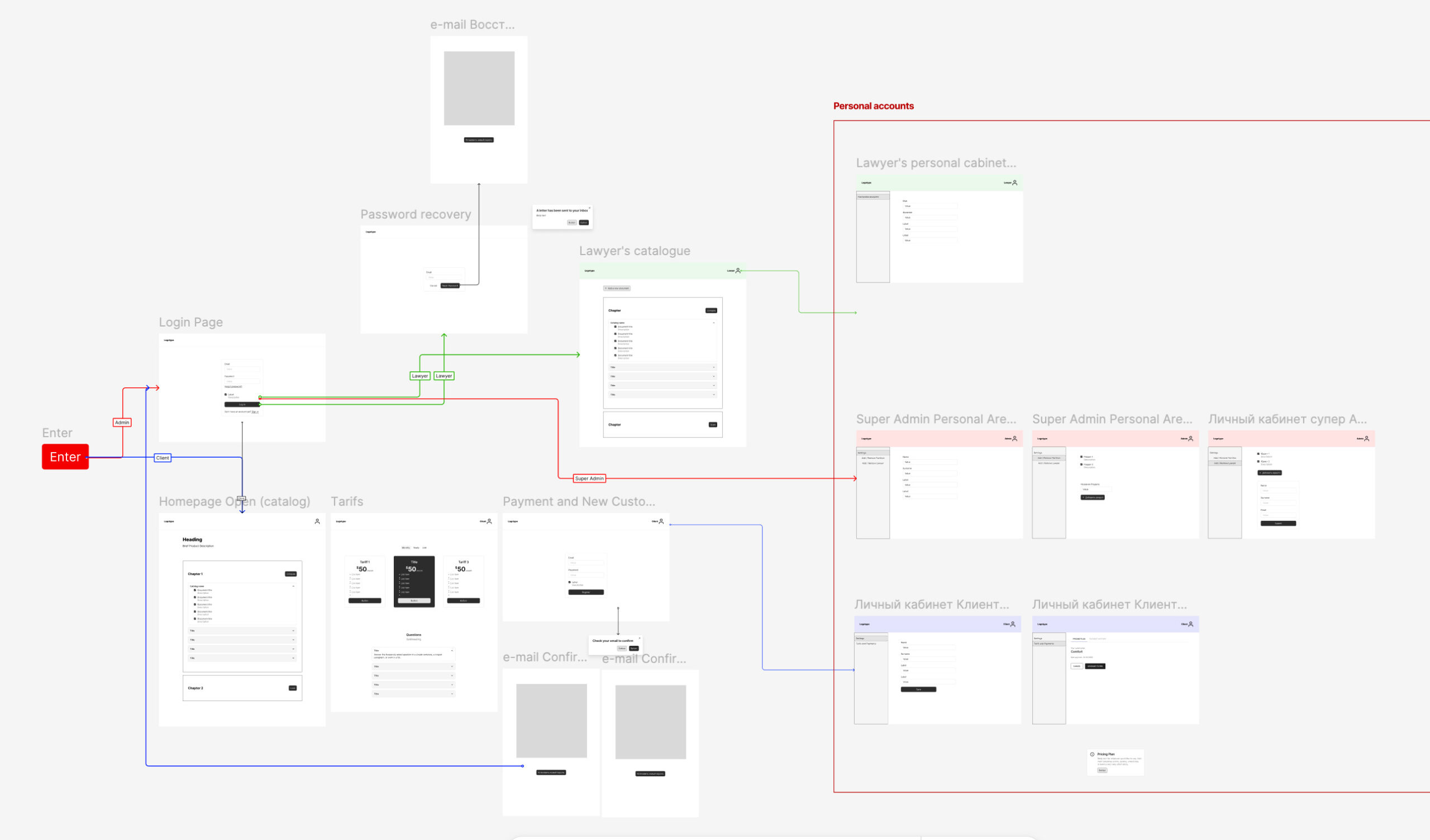
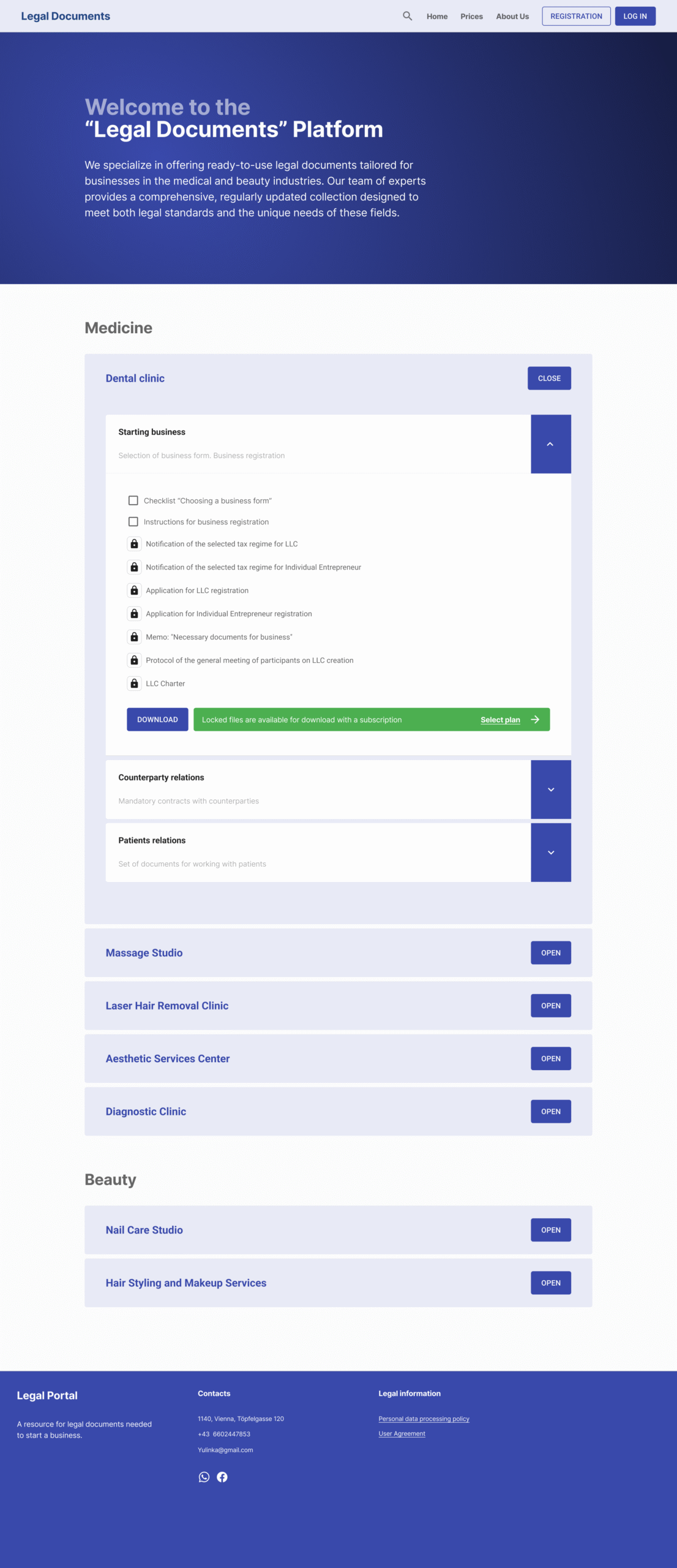
I built core MVP features with minimal yet reliable design, using wireframes, user-flows and interactive prototypes
//WIREFRAMES AND USER_FLOWS MVP
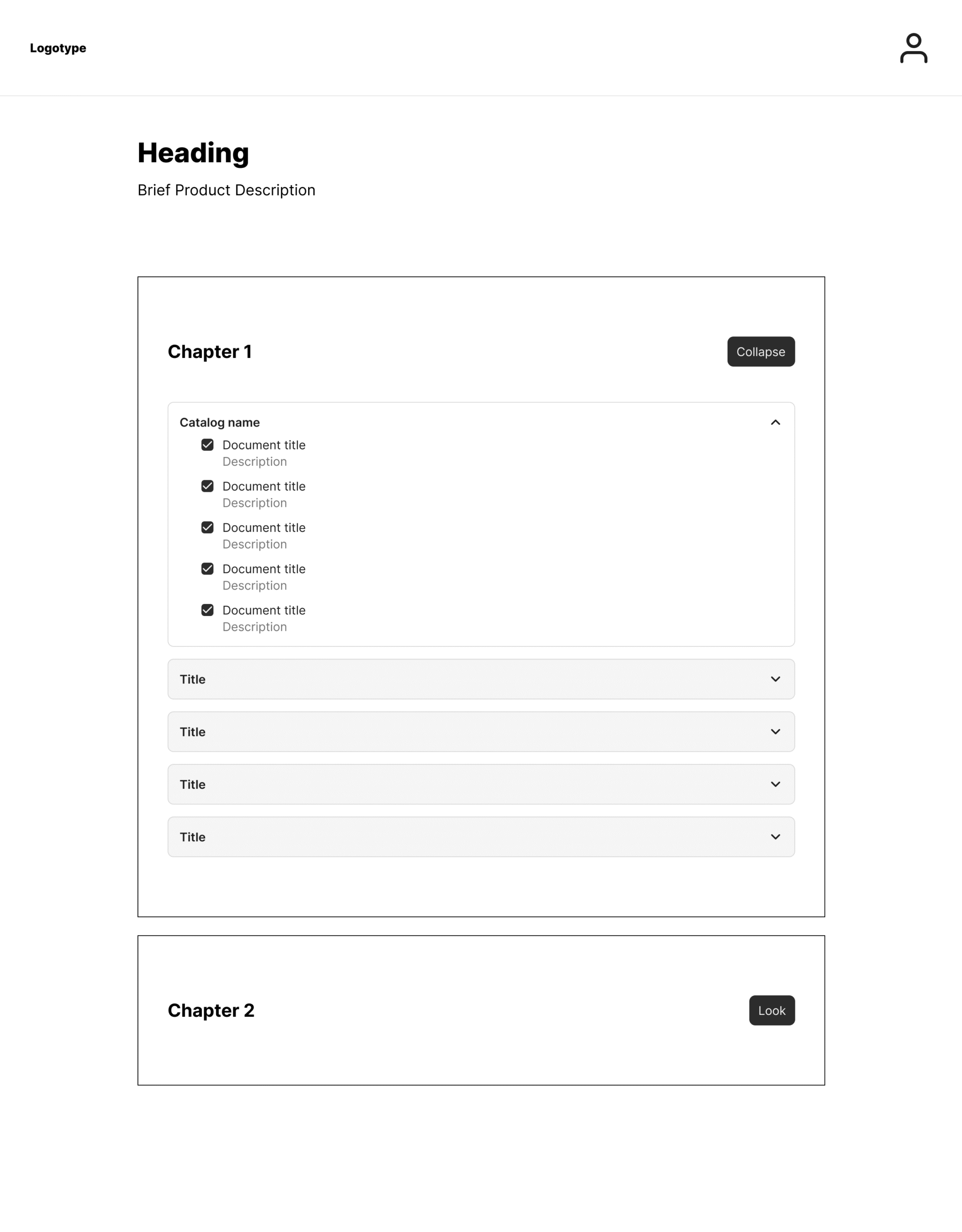
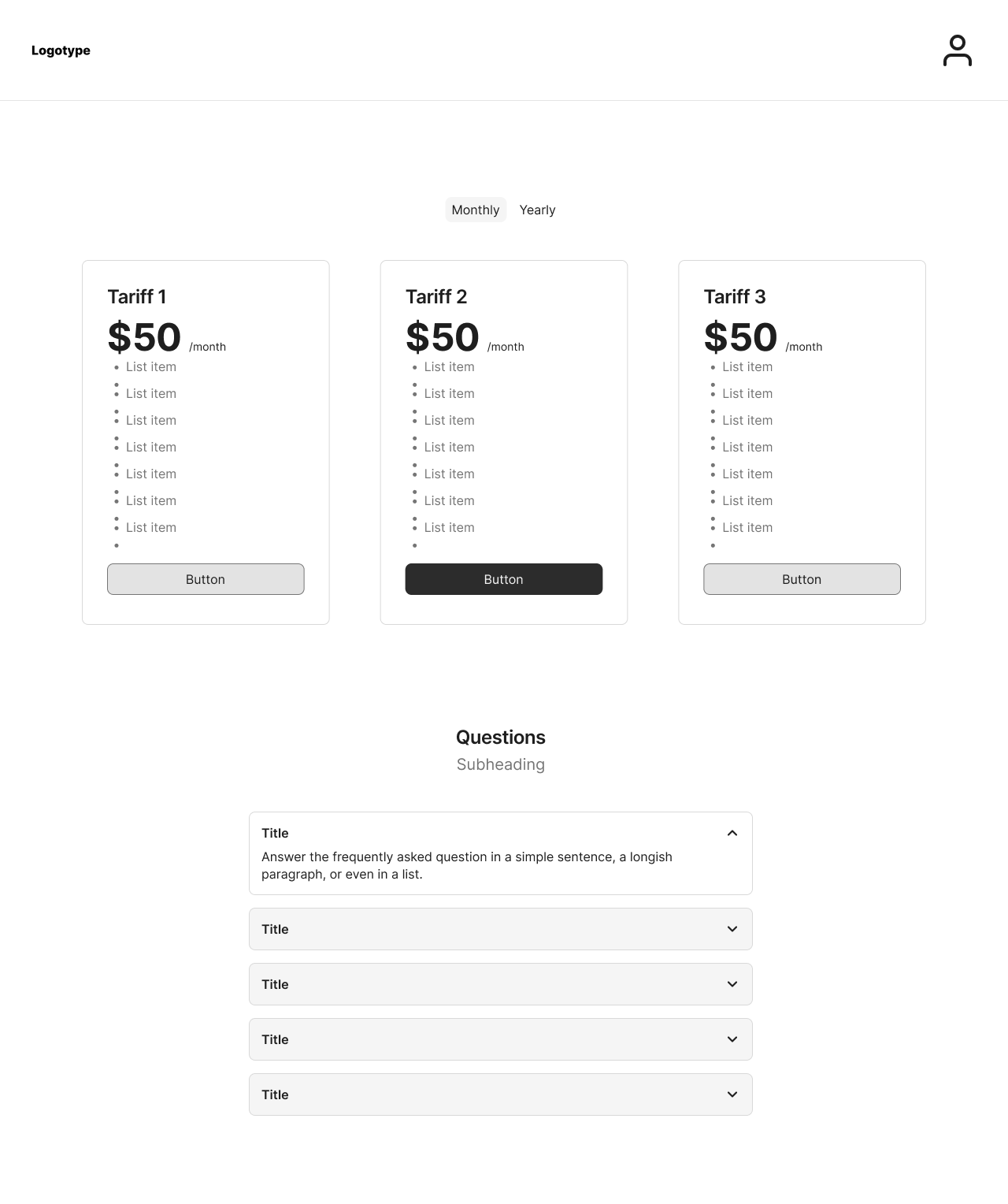
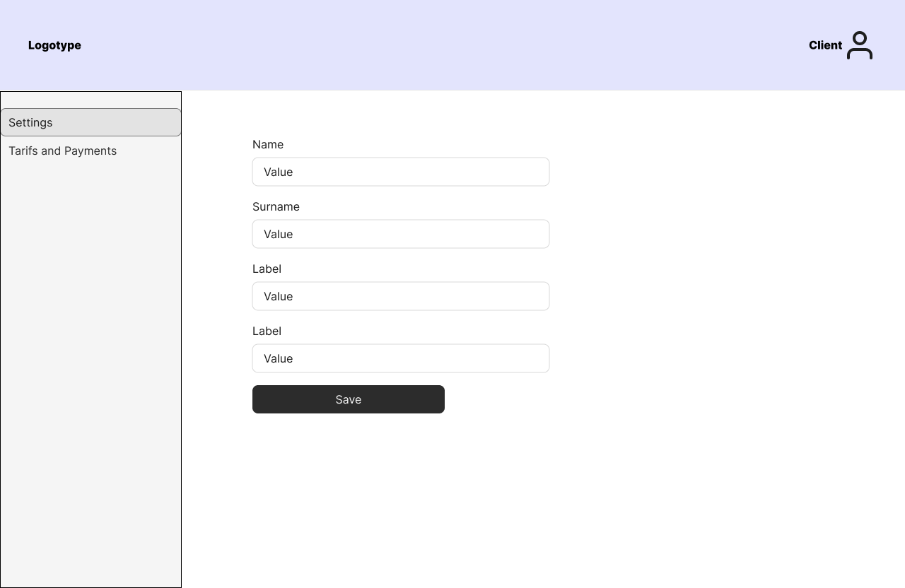
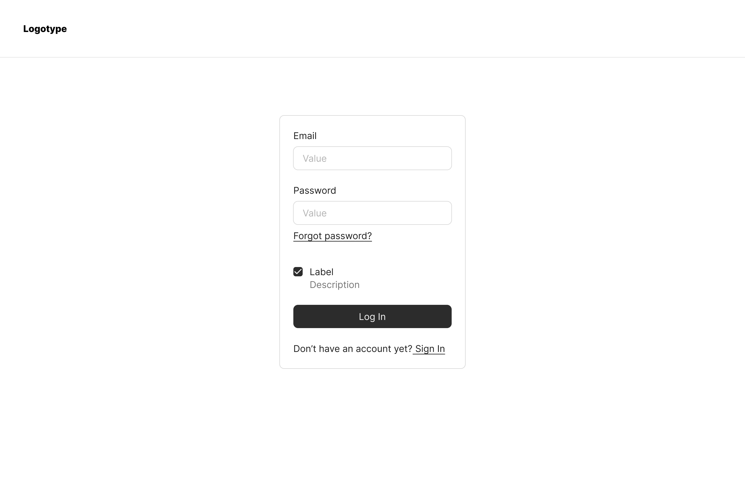
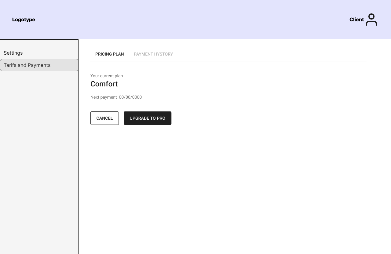
//PROTOTYPES MVP
//PROCESS
05
User Test Results
The business owner gathered feedback from one user and shared it with us; however, I did not have the opportunity to clarify details or ask follow-up questions.
He didn’t understand how to use the site
He didn’t understand what kind of documents are here
He didn’t understand what should he do with it
Research Limitations Identified
- User context unknown: Couldn’t determine if the feedback user was a business owner, had business experience, or was a lawyer
- Sample size: Only one user provided feedback
- Testing scope: Very limited volume of user tests
//PROCESS
Takeways and outcomes for the next iteration:
01
The platform proved its potential by providing access to legal templates and tools, demonstrating a demand for a centralized legal document system.
02
Key User Insights
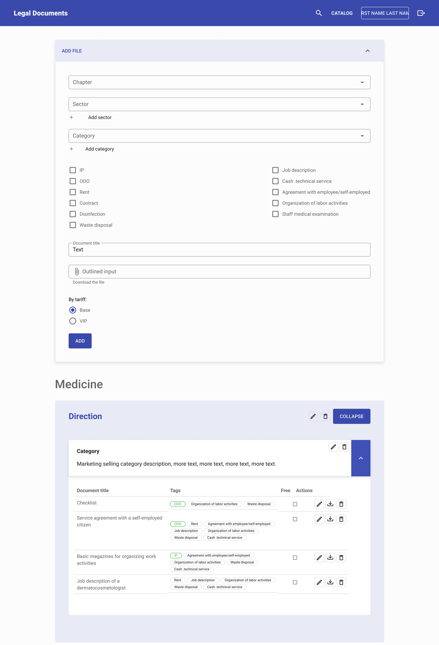
- Confusion in Catalog Navigation: Users didn’t understand how to use the document catalog. They struggled to identify what documents were included, how to select them, and where to start.
- The value proposition wasn’t immediately apparent, leading to low initial engagement.
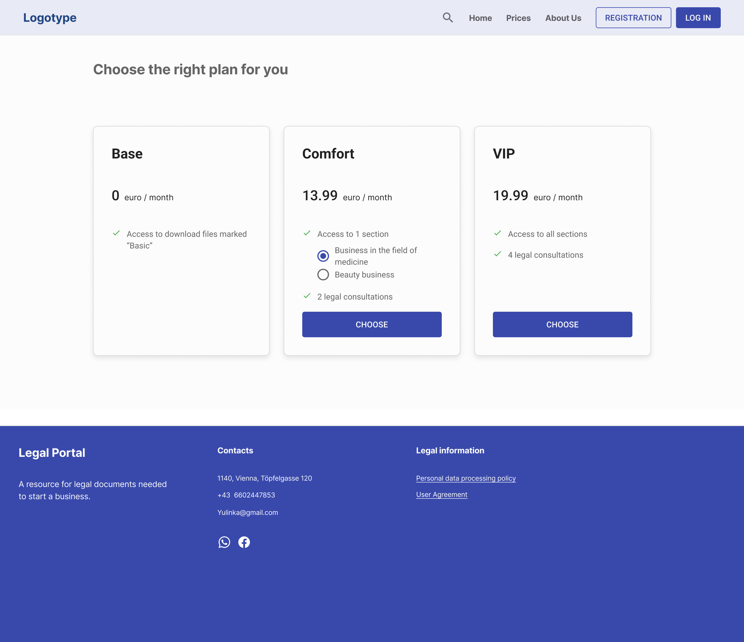
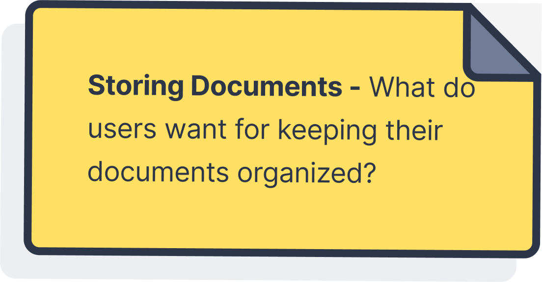
- The pricing model was seen as too rigid and expensive, prompting discussions on subscription-based options.
//PROCESS
STAGE 2.0
Prioritized Improvements for Stage 2.0
Addressing user pain points from previos stage, I came up with following solutions:
01
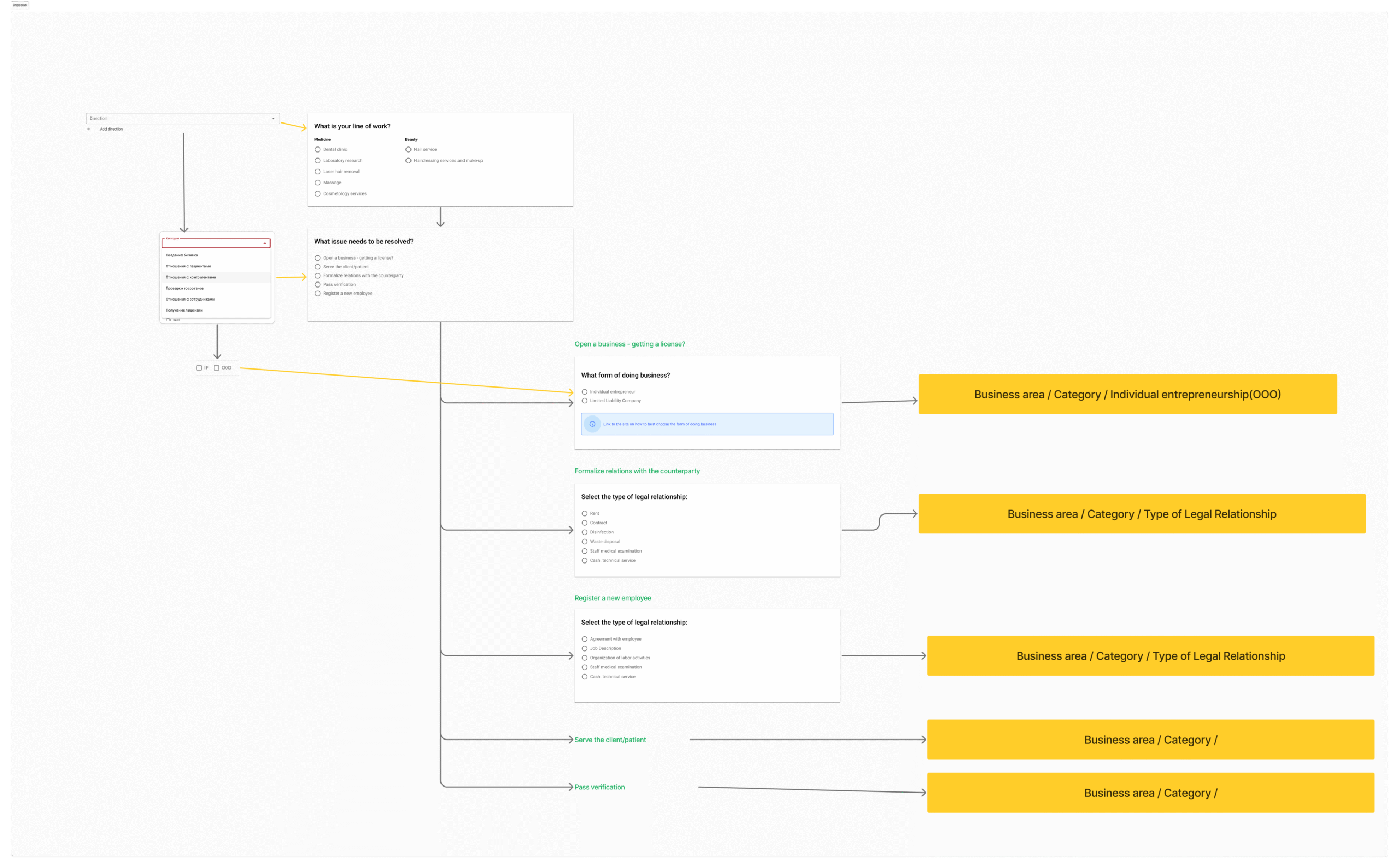
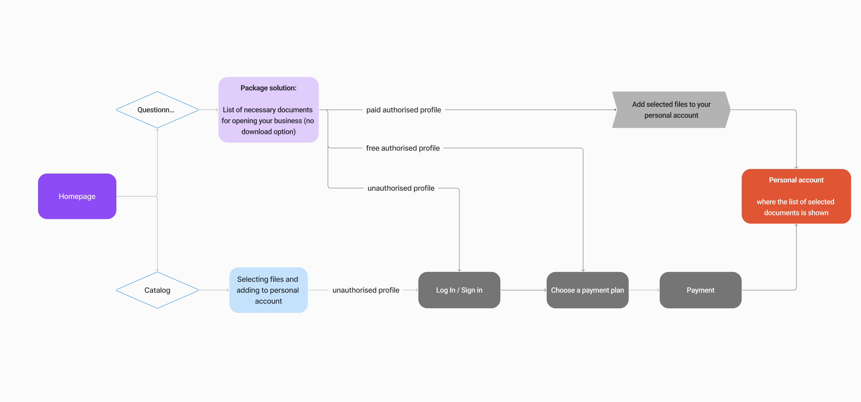
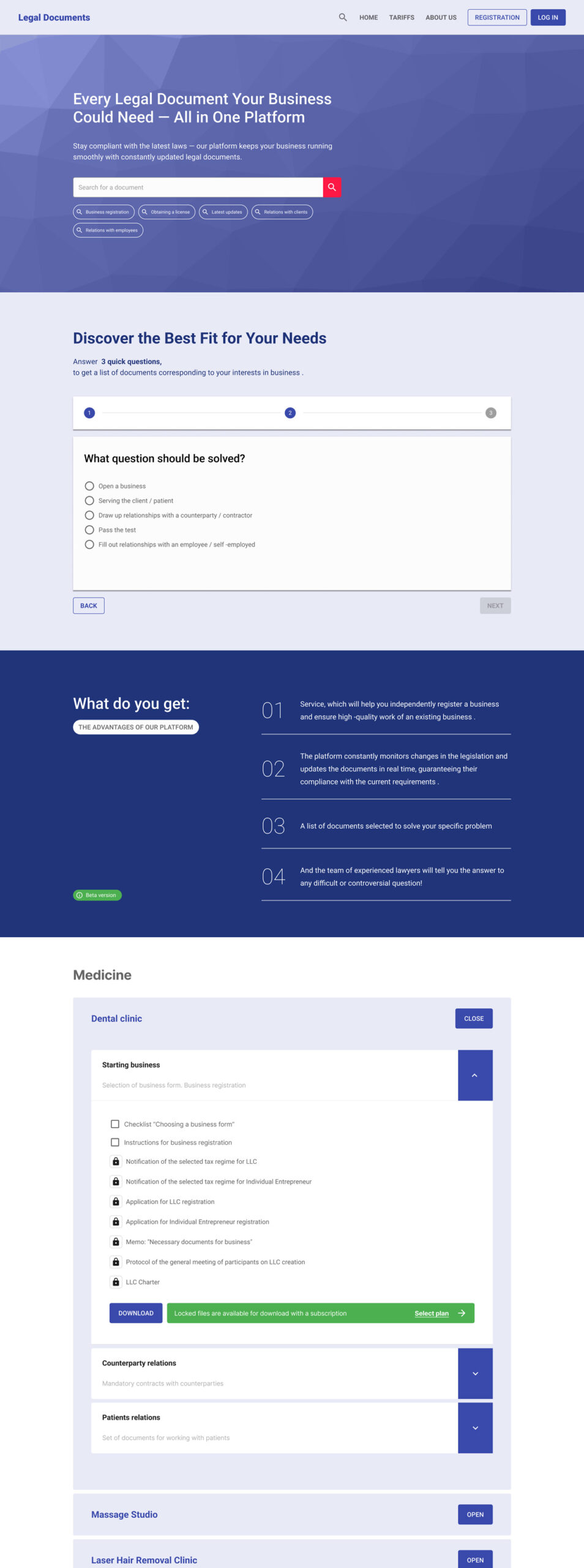
By introducing a guided questionnaire that provided personalized document recommendations, I transformed a confusing «library browsing» experience into a helpful “personalized document recommendation” experience. Instead of overwhelming users with a full catalog, the survey provided a structured path to identify a list of documents addressing specific user’s need.
//questionnaire
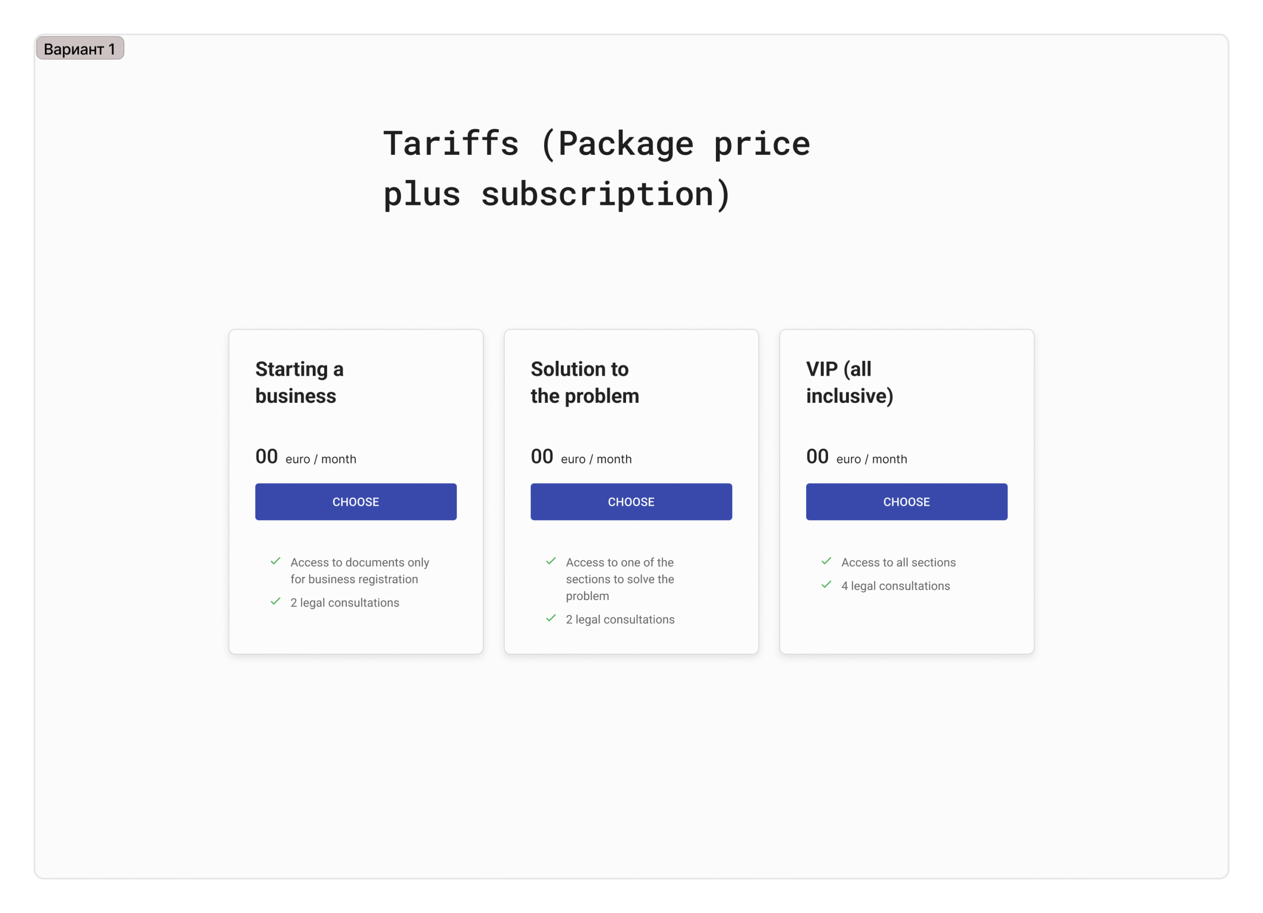
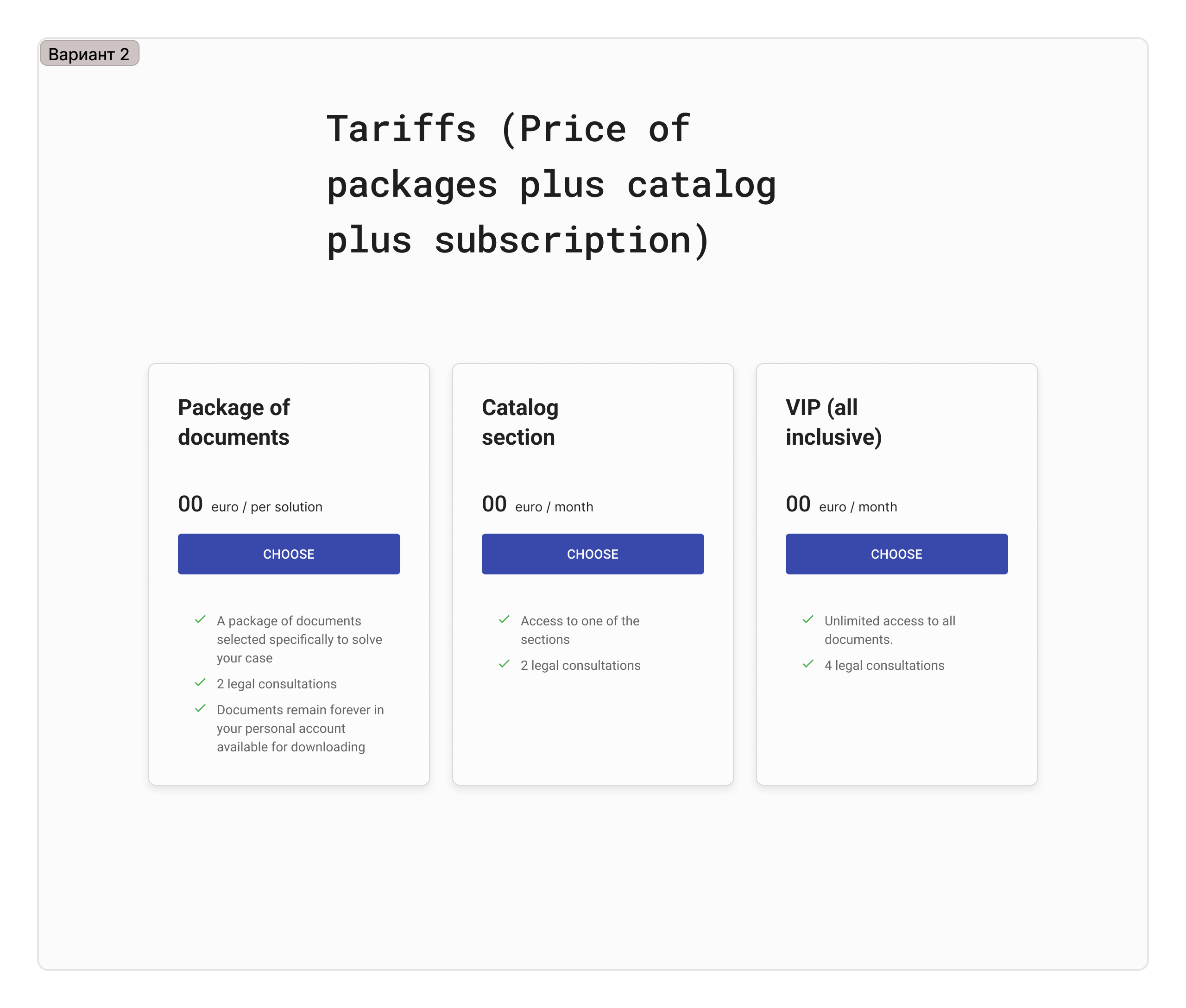
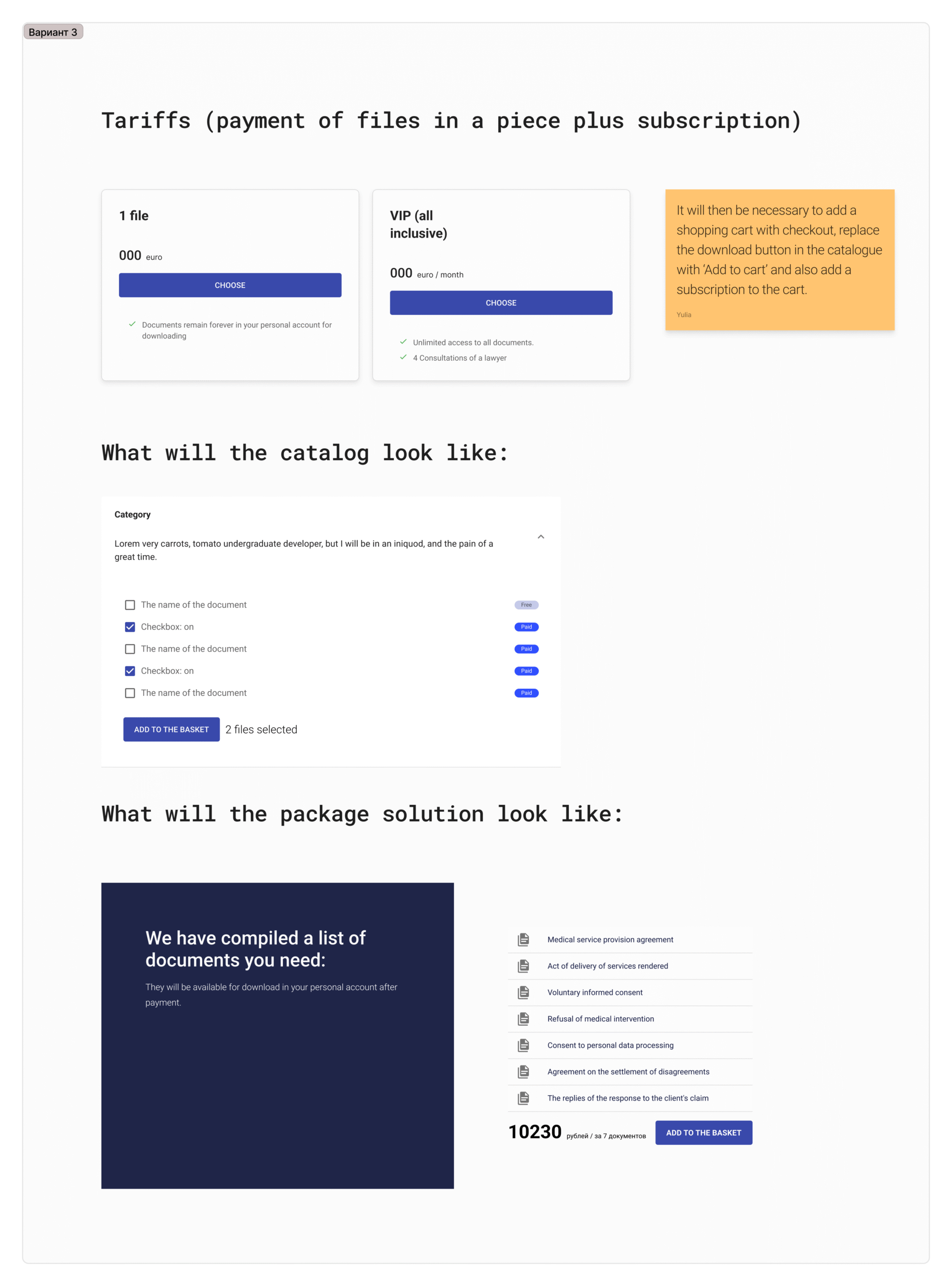
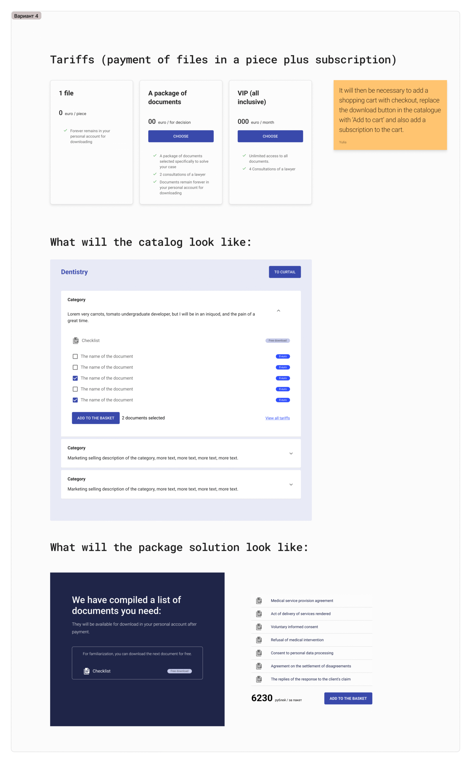
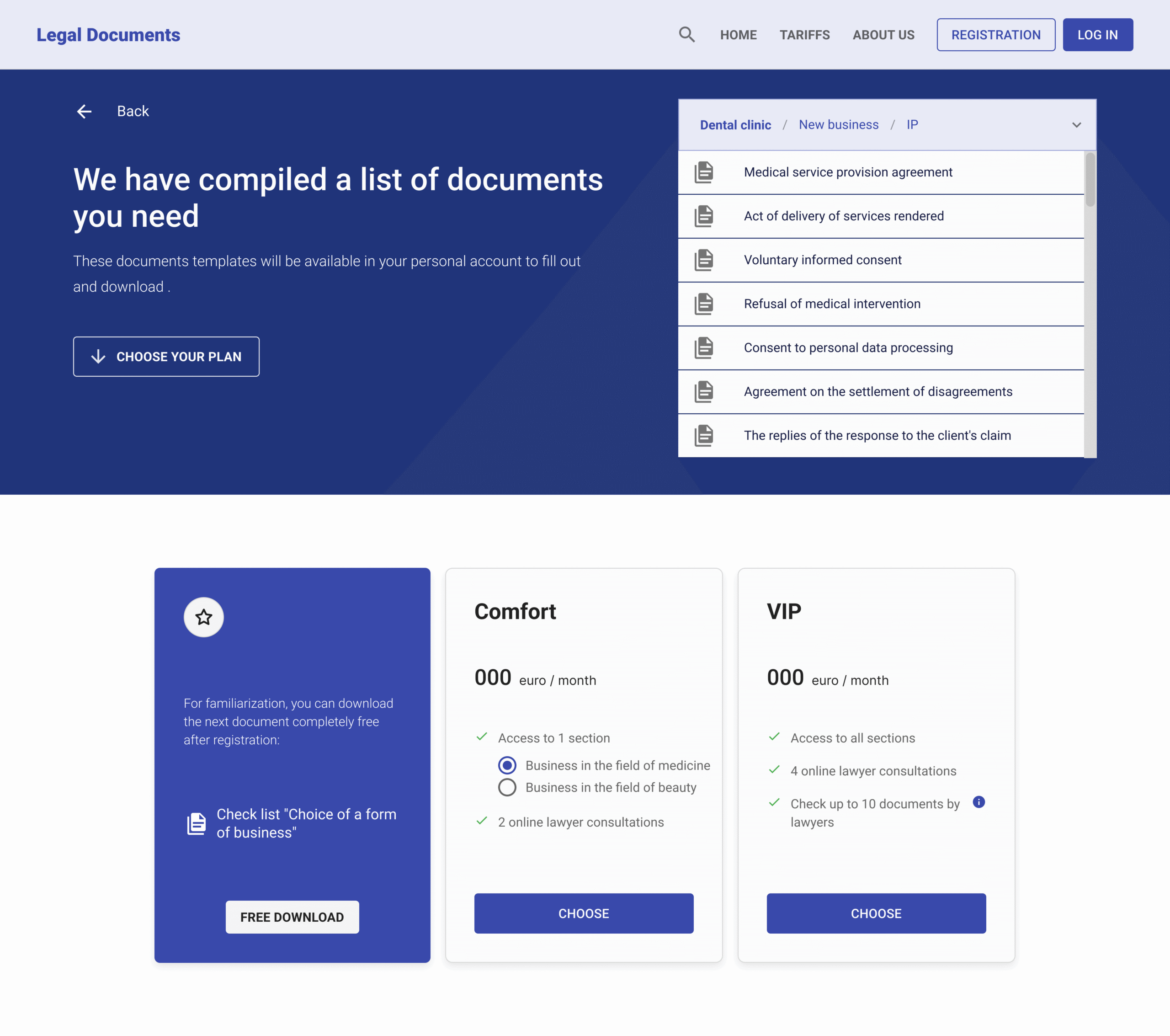
//PRICING PLANS TESTS
//PROCESS
02
Implemented tagging system to mark updated vs. outdated documents
03
Tested different pricing models including subscriptions and individual document purchases
04
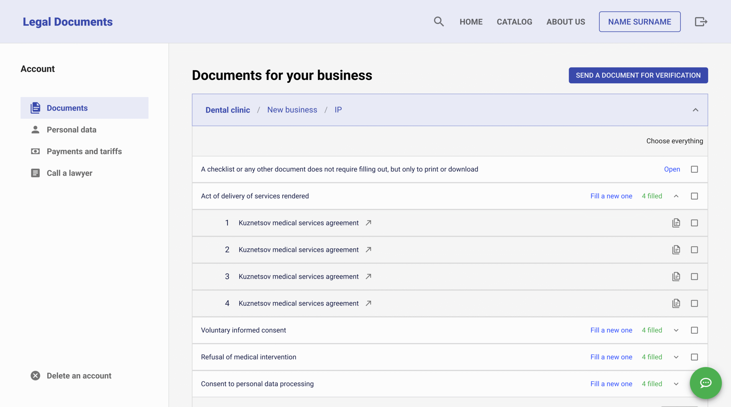
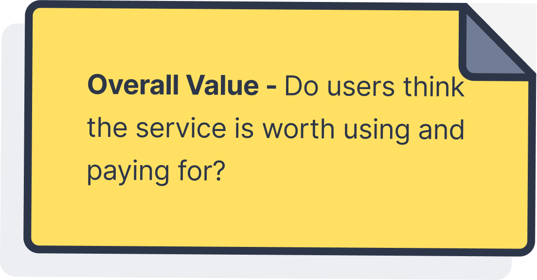
Introduction a feature of filling the document in the user account section
05
Designed Live support channel from lawyers of this company
//PROCESS
User Test Results
The second phase user interviews with three beauty salon owners revealed critical usability issues.
- Individual purchase preference: Users wanted to buy documents separately rather than subscribe to the service
- Documents filling form complexity issues: Users found too many fields to fill and didn’t understand required formats or information
- All three users said they would delegate document filling to subordinates due to complexity
- User testing confirmed the UX designer’s warnings about the document filling feature being too difficult
- Development waste confirmed: Significant time was spent building a feature that users ultimately rejected
//What We Tested


PROJECT OUTCOME
The project was put on hold at this stage because no users were willing to pay for it in its current form, and the business owner decided not to invest further in developing a full product.
//PROCESS
Lessons Learned:
01
Next time, I would organize an initial project workshop to collaboratively define the roadmap, key milestones, potential roadblocks, and success metrics (KPIs) with all stakeholders.
This upfront alignment session would ensure everyone has a clear understanding of the project scope, expectations, and their respective roles from the outset.
02
I would validate the core value proposition and user understanding through early concept testing before investing in detailed design and development work.
03
I would create and test clear onboarding flows and value proposition explanations early, ensuring users immediately understand what the platform offers and how to use it.