E-COMMERCE
B2C
Wolford
Wolford is a clothing manufacturer, known for its luxury lingerie and legwear garments.
During my 4.5 years of work, I held the sole designer role, which involved:
11.2017 — 03.2022 / 4 years 4 months
ROLE: UX/UI Designer
//Dec 2020 – Mar 2022
Full online shop UX/UI redesign
Overview
I led a full UX/UI redesign of the Wolford online shop, transforming both its visual style and the structure of every core page.
The Wolford online shop provides service in 25 countries worldwide
Goal
To create a new digital brand identity for Wolford and improve the online shopping experience by redesigning:
- Main menu,
- Homepage
- Category pages
- Product pages
- Check-out
Challenges
01
Outdated Design
02
Navigation Complexity
03
Inconsistent Look and Feel
04
Conversion Roadblocks
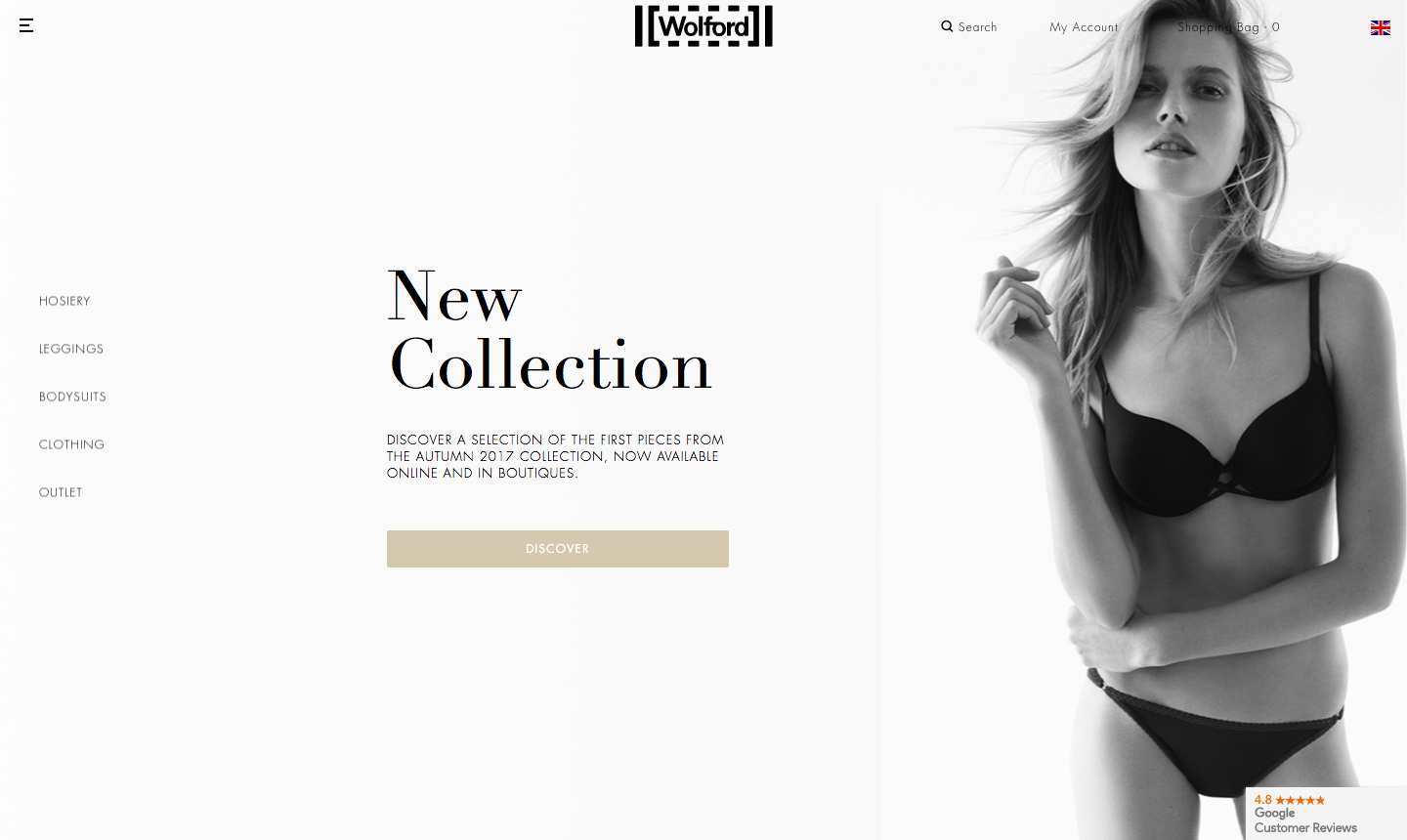
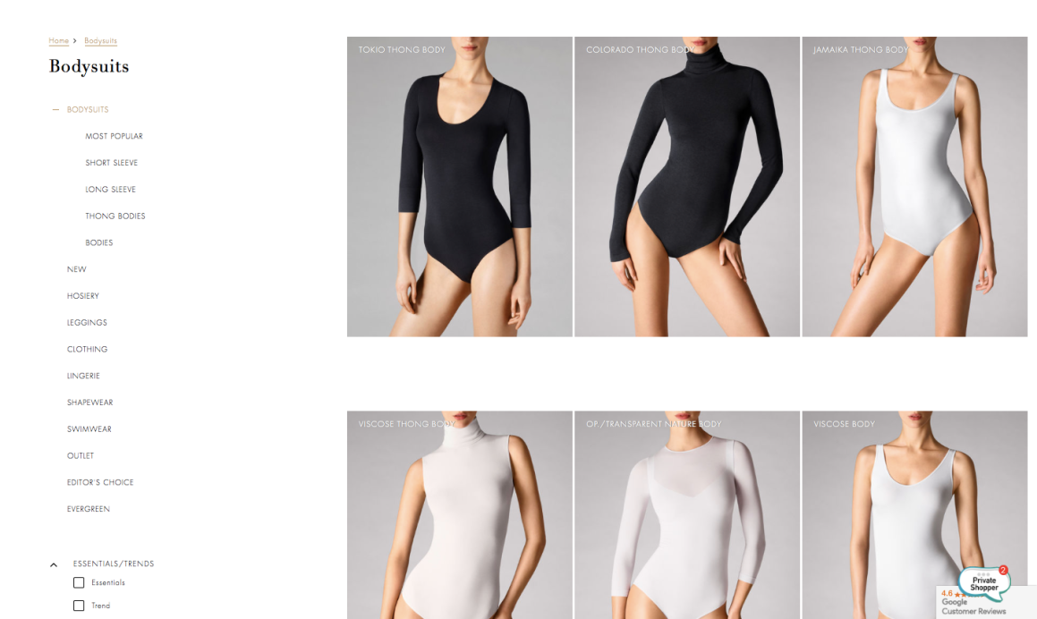
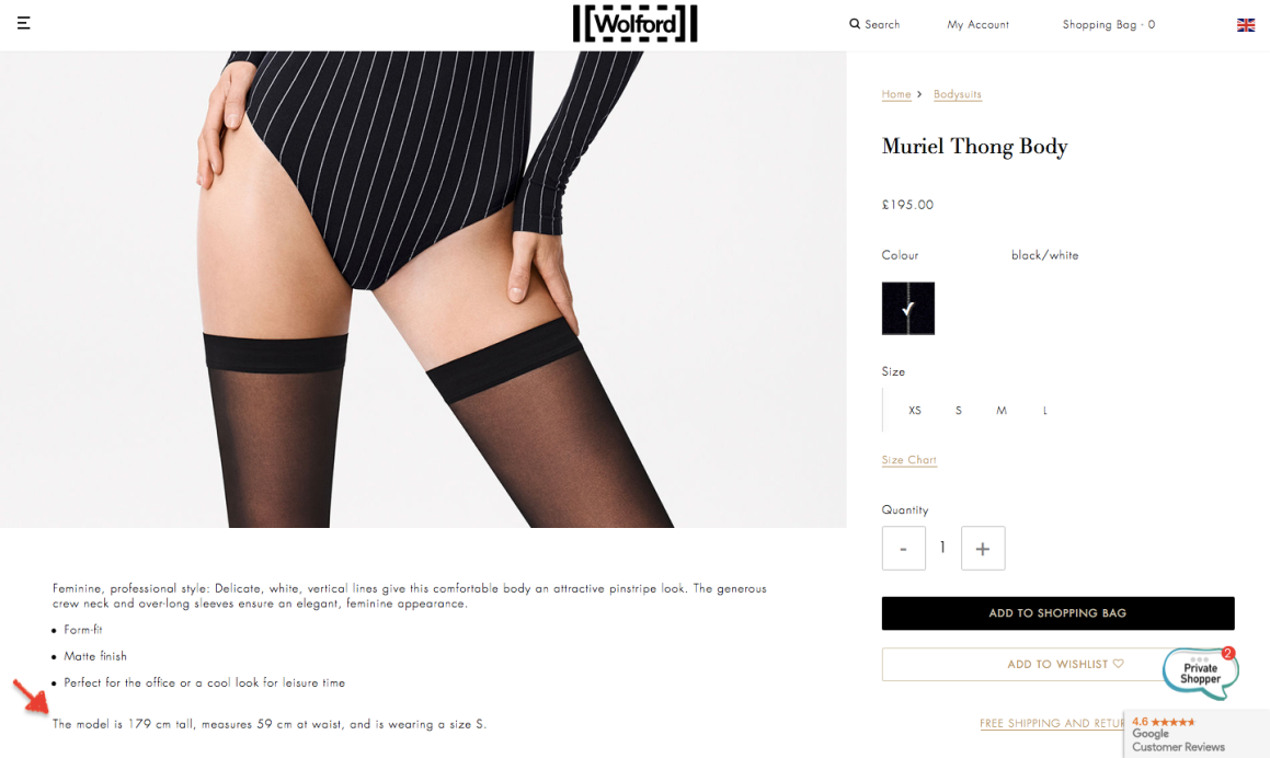
Web-Site BEFORE
//MY PROCESS
Research & Defining the Problem
After research that included a navigation audit, user feedback collection, and competitive analysis of similar premium fashion e-commerce sites, the main issues identified were:
MAIN MENU PROBLEMS
01
Categories are not logically structured
- Excessive nesting → breaks logical grouping.
- Inconsistent menu placement → makes the category structure feel different across pages.
02
Lack of clear filtering
No quick way to filter products by size, color, material, type, and price directly in the catalog. This slows down product discovery and worsens the shopping experience.
03
Active category is not visually highlighted
04
Mobile navigation changes logic from desktop, causing confusion.
In the mobile version, the menu changes its position and stops being always accessible, making quick category switching harder.
05
Duplicate navigation menus on desktop
The desktop version contains both a hamburger menu and a horizontal menu directly below it. This creates redundancy, inconsistent category availability between menus, and confusion about where to navigate
PRODUCT PAGE PROBLEMS
06
Text hierarchy imbalance
Lack of clear visual grouping
07
Inconsistent button states & labels
Desktop shows «Add to Cart» even for unavailable sizes, with small “Product out of stock?” text.
08
Active Oversized Product Imagery
All steps appeared on one page instead of being split into logical stages (e.g., Shipping → Payment → Review), which made the process harder to follow and increased the risk of abandonment.
CHECK-OUT PROBLEMS
09
Overwhelming Number of Fields on a Single Page imbalance
The checkout displayed too many form fields at once, creating visual overload and making it difficult for users to navigate through the process.
10
Many input fields did not support multiple common formats
(e.g., phone numbers, postal codes), leading to repeated errors. There was no clear, upfront indication of the required format, causing user frustration.
11
Lack of Guided Flow
Product images take up too much vertical space, forcing users to scroll to see the item in full.
This disrupts product evaluation (especially for items where length and proportions matter) and pushes key purchase elements out of immediate view.
//MY PROCESS
Generate Ideas & Solutions
NAVIGATION
01
Introduced a horizontal top navigation on desktop to display all primary categories
This approach is especially effective for a brand like Wolford with many categories and subcategories, as it minimizes clicks, improves discoverability, and supports a more premium shopping experience.
02
Filtering:
On the Category page — multi-select filters with visual chips: color, price slider, size, denier, shaping effect.
03
Better Organization of Categories & Subcategories:
Consolidated and structured category lists to avoid overwhelming users while still showcasing the full product range.
Highlight active category with visual cues,
sticky navigation.
04
Consistent Mobile Experience
Improved mobile navigation hierarchy for quicker access to key categories, reflecting the same logical grouping as desktop.
Reduced the need for deep scrolling or multiple taps to find popular items.
PRODUCT PAGE
05
Clear Visual Hierarchy
Balanced layout with proper spacing, modular sections, and better flow of information.
06
Improved Call-to-Action (CTA)
CTA is prominent, accessible, and grouped logically with size/quantity selectors.
07
Collapsible Information Sections
Accordion layout keeps the product page visually clean and easy to scan, especially on mobile devices, where it minimizes scrolling and maintains focus on the key actions.
08
Improved Image Display
The previous full-page image forced users to scroll up and down to see the entire product, while the redesigned multi-angle gallery displays the item in full view at once and provides the multi-angle gallery with zoomed-in views.
//WIREFRAMES CHECK_OUT
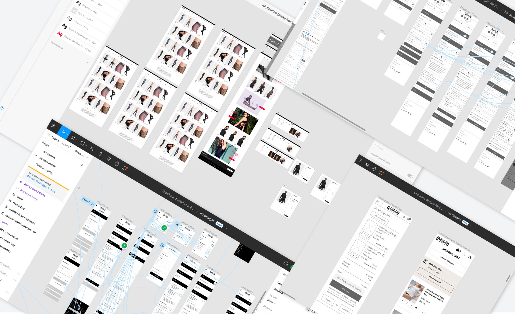
Interactive Prototypes
//MY PROCESS
Prototype, Test & Implement
Wireframes & prototypes showing reorganized main menu, filters, and sticky navigation.
Usability testing with existing Wolford customers to validate: Ease of finding products, satisfaction with filters, mobile/desktop consistency.
Observational study with Hotjar to analyze user behavior patterns and identify navigation pain points through session recordings and heatmaps.
A/B testing the new navigation vs current one to measure: Bounce rate changes, time to find a product, conversion rates.

Homepage 
Category page 
Product Page 
Check-out
//RESULTS AND TAKEAWAYS
Through a strategic combination of user-centric design principles, collaborative efforts, and iterative prototyping, we successfully transformed the Wolford global online shop
01
The major elements were redesigned, such as the Main menu, Homepage, Category pages, Product pages.
02
A new checkout flow, designed as a wizard, was created to eliminate obstacles in the customer journey, aiming to minimize the bounce rate.
03
The measured impact on a global level is coved with an increase of Session Duration by 11% and a decreased Bounce-rate by 5%.
04
Online sales overall increased by 45% in the short fiscal year 2020. This indicates a qualitative UX/UI development for our web-shop and marketing channel activities.
05
The size guide was optimized with more user-friendly size charts, aligned with the measurement units used in each country.
//Nov 2017 – Nov 2020
E‑Commerce Design & Optimization
Overview
Digital asset creation & marketing design for the B2C e‑commerce platform across EMEA & US.
Responsibilities
01
Designed promotional landing pages, newsletters, banners, and seasonal campaign assets.
02
Created high-performing newsletters optimized with A/B testing (subject lines, CTA placement, layout).
03
Collaborated with CRM and performance marketing teams to deliver conversion-focused visuals.
04
Maintained brand consistency across all digital channels, adapting assets for regional markets.
05
Supported small UX improvements to homepage, product detail pages, and checkout flow.
//E‑Commerce Design & Optimization
Homepage Design

//E‑Commerce Design & Optimization
Landing Page Design
Campaign-driven, seasonal sales & product launches.

//E‑Commerce Design & Optimization
Newsletters Design
Performance-focused designs incorporating analytics insights.

//TESTIMONIALS
Matteo Petruzzellis
Head of Online Department,
wolford
«Very eager to learn, Yulia grew very quickly from the generic graphic / web designer role into a much more specialized UX/UI professional, able to conceptualize and craft effective digital products.
As the only designer in the Online Dept, she brilliantly took ownership of most web graphics production for all locales across the EMEA and US markets.
Thanks to her unique personality, she contributed to the fun we enjoyed in the very diverse, very multicultural team we had, and got the trust and respect of everyone.
She’s also a strong photographer, with great taste and an excellent sense of visual composition.»